Page 4 of 21
Re: Computer Coloured Monochrome
Posted: Mon Dec 09, 2013 11:56 pm
by S.A.C. Martin
Darwin4975 wrote:
The short-lived BR blue was quite distinctive and very different from garter blue.
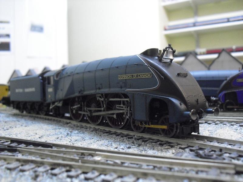
Er - not as simple as that. British Railways "Express Passenger Blue", and "Experimental blue" were definitely different to LNER "Garter blue" in shade, however the photograph you have there shows 60010
Dominion of Canada in full LNER "Garter blue" livery, but with British Railways branding. It should therefore match the other LNER liveried A4s of the time for the shade of the blue as it is the same livery simply renumbered and rebranded.
It is also not 100% full proof that the cab side and tender lettering were cream or white with all of the A4s in this interim livery. There is a well known shot of Seagull on the interchange trials showing very much cream numbering and lettering in one publication but in another the same shot shows them up as white, bordering on a silver. It all depends on the publication of the shot. RCTS 2A is your best guide here, or photographs of the intended subject.
Re: Computer Coloured Monochrome
Posted: Tue Dec 10, 2013 3:29 pm
by Darwin4975
The knuckles have been well and truly rapped as you are quite right. This locomotive received BR blue in Sept.'50.
Attached is how it should be so long as we can agree on the shade. It took very little time to make the colour adjustment -a couple of minutes which gives you some idea of how flexible the technology can be.
Re: Computer Coloured Monochrome
Posted: Tue Dec 10, 2013 5:47 pm
by 34F
I must admit I do like this latest attempt it does look more like a colour photograph taken at the time rather than a black and white one that has been colourised. Certainly to someone who has a particular picture they are willing to and able to spend hours upon hours layering up the colouring or shading this process could have some stunning results.
David
Re: Computer Coloured Monochrome
Posted: Tue Dec 10, 2013 9:32 pm
by Darwin4975
I am still working on Falcon at Leeds in 1948. There are sometimes parts of a picture which will certainly have been coloured but only research will provide the answer. Here, the Leeds City West signal box clearly had coloured letters as they show up grey on the monochrome print. Does anyone know the correct colour? Also the door behind the right buffer. The W44 label on the ground indicators was coloured. The two bottom indicators were probably white or light cream but the top one was a colour, perhaps red.
I have several unfinished efforts such as this waiting for the right answers to complete the picture. If anyone can help with the above questions I'd be most grateful to hear further. Incidentally the red line which separated the black smokebox from the nearest edge of garter blue is quite invisible in the original print (see detail). This shows just how insensitive to red was panchromatic film, as the red and white lines were the same width (quarter inch).
Next time I'll provide something completely different for a change.
Re: Computer Coloured Monochrome
Posted: Tue Dec 10, 2013 10:56 pm
by Iron Duke
A comparison (albeit 4498) taken in 1974 using Kodachrome 64
Re: Computer Coloured Monochrome
Posted: Thu Dec 12, 2013 9:30 pm
by S.A.C. Martin
Darwin4975 wrote:The knuckles have been well and truly rapped as you are quite right. This locomotive received BR blue in Sept.'50.
Attached is how it should be so long as we can agree on the shade. It took very little time to make the colour adjustment -a couple of minutes which gives you some idea of how flexible the technology can be.
Not intended to rap - the second attempt is terrific, much more as I imagined.
Funny as that was one of my first A4 conversions over a year ago.
I later discovered I had the nameplate colour wrong, so out came the spare red and silver nameplates instead.
Re: Computer Coloured Monochrome
Posted: Sat Dec 14, 2013 2:46 pm
by Darwin4975
Something else for a change. This scene was taken by me in b/w on 35mm in August '61. Darlington was only about 10 miles from my home at the time and I often cycled there to visit the railway installations -never missing out on the shed 'dead line'. (The same dead line had provided me two years earlier with the sight of B17 61661). Here, an ex-works B16 is being dragged along with several others by a J27 (65791) which was also ex-works. The leaking steam suggests she may have been sent to North Rd for further attention before being despatched back to Percy Main. The dovecote in the distance was blue -I remember that which is fortunate as otherwise the fact would be lost history. Generally, 35mm negatives are not good subjects for CCM as the format is too small but this is an unusually sharp negative. The crest shows up nicely. Colour albums of genuine transparencies are useful for getting colour details such as these correct.
Re: Computer Coloured Monochrome
Posted: Sun Dec 15, 2013 1:30 pm
by strang steel
That is excellent - I think my favourite one so far. If I had not have known, I would have believed that was an actual colour photo.
Congratulations.
Re: Computer Coloured Monochrome
Posted: Sun Dec 15, 2013 5:25 pm
by giner
Me, too. It looks totally natural. I guess that's the biggest compliment you can give.
Re: Computer Coloured Monochrome
Posted: Mon Dec 16, 2013 12:40 am
by 52D
Enclosed is a computer coloured monochrome I promised a few posts ago. It was from a pic originally supplied by 52A and was done by a friend of a friend. There will be no one alive today who can remember this loco in its fresh from the works state and because of the subject rarity its worth sharing with the forum. The original version is much better as a lot of compression has been applied to the pic to get it to fit on the forum.
Blyth & Tyne No.1316 at Percy Main. Pic supplied by Philip Hodggets from the fb page Railways of Berwick and the Eastern Borders.
Please click on the picture for a better view
Re: Computer Coloured Monochrome
Posted: Mon Dec 16, 2013 1:20 am
by JASd17
giner wrote:Me, too. It looks totally natural. I guess that's the biggest compliment you can give.
Have you really looked at the lack of tones/shades in this?
It is not real!
John
Re: Computer Coloured Monochrome
Posted: Mon Dec 16, 2013 3:39 am
by Albergman
Darwin4975 Well it's said you can't please all of the people all of the time etc etc. Regardless, I think you are doing wonderful things here. I prefer to see the original black and white along with the conversion because it makes the transition so much more powerful. An original might be just a barely interesting B/W but it becomes a truly fascinating image when coloured ... in my humble opinion anyway. This effect is most noticeable in your B16 image yesterday. Certainly in no way "cartoonish" or Disney-like. Really!
I've done a bit of this colour correction using Photoshop Elements when I volunteered at a motorsport archives. Many slides had deteriorated to become only shades of red and pointless to look at but, even though I showed the archivist the folder of amazingly recovered images he forbade them to be seen or kept. I understand that one shouldn't tamper with the history in an archive but these images bore no resemblance to what had been captured on the day. I saw no harm in just having a corrected set in addition to the originals but no ...
Anyway, keep up the good work. I look forward to your new work.
FWIW ... (52D) maybe this latest image is still under development but your roofs look too red and uniform at present (sorry)
Re: Computer Coloured Monochrome
Posted: Mon Dec 16, 2013 10:05 am
by strang steel
Yes, I was going to mention the brickwork in the background earlier but hadn't the heart as the loco was the subject matter. However, I do agree that the buildings have the look of a modern industrial unit about them. I have no idea when they were constructed, but I suspect that the soot laden air of that era would have darkened them rather quickly.
Re: Computer Coloured Monochrome
Posted: Mon Dec 16, 2013 6:42 pm
by giner
JASd17 wrote:giner wrote:Me, too. It looks totally natural. I guess that's the biggest compliment you can give.
Have you really looked at the lack of tones/shades in this?
It is not real!
John
I think we all
know it's not 'real'. That's the whole point of the exercise. I hate to play Capt. Obvious, but what you see and what I see, regardless of what it is, will always be different.
Re: Computer Coloured Monochrome
Posted: Mon Dec 16, 2013 11:48 pm
by Darwin4975
Great to see someone else's work. The long boilered 0-6-0 has been done well. Clearly a lovely pin sharp negative which is the essential starting point. The skin tones of the driver etc are excellent. There is a tendency to make the colours too garish when starting to make colour conversions. I have taken a screen shot of this image and made a few low resolution adjustments. (Not foreground.) The background buildings look as if they are grey/blue slated rather than tiled. The motion bearings may well have been bronze and the sand pipes copper. I have found that black never looks black/grey. A hint of brown washed over the black smokebox/chimney helps. Any greyscale left in the colour image tends to show up as such. Hope to see more from others.