Page 1 of 1
LNER Platform & Station Signs
Posted: Tue Oct 20, 2020 8:04 pm
by Lichfeldian
What colour were LNER station and platform signs please? I've always assumed they were white Gill Sans on a dark blue background, more or less the same as for the post nationalisation BR signs and I have seen some examples on line (see attached, if I have loaded it correctly!). However, the Station Colours website seems to suggest signage was white lettering on a black background and in on-line photos of the restored Pickering Station, platform numbers are circular, not the BR rectangles these at least, seem to be white on black. Does this also apply to running-in boards? Thanks.
Re: LNER Platform & Station Signs
Posted: Thu Oct 22, 2020 5:58 pm
by GrandParade
I'm sorry, Lichfeldian, but I can't help you. I have exactly the same question myself! Particularly wrt Running-in Boards. The latter are certainly white on black at Pickering, which is supposed to be"Gold Standard". But Scalescenes obviously think they are dark blue.
Re: LNER Platform & Station Signs
Posted: Sun Oct 25, 2020 11:57 am
by Seagull
So far as I have seen between the wars (on the old GNR section) signs were white on black with mixed lettering styles in use until Gill Sans predominates in the latter 1930's. Gill Sans did not take over completely as some running in signs never seem to have been changed and probably many other smaller signs likely were never replaced if they were in good condition.
I believe but cannot confirm that white on black was what was used across the rest of the LNER, but again often with different lettering styles depending probably on the individual sign painter.
I don't think the white on blue came into use until 1946 onwards as part of the attempts to brighten things up post war.
Alan
Re: LNER Platform & Station Signs
Posted: Mon Oct 26, 2020 2:51 pm
by Lichfeldian
I'm adopting the 1937 green and white paint scheme for my (entirely fictitious) station scene. Therefore in my fictitious part of the LNER system, the management decided to turn the station into an example of the "new look" including revised Gill Sans signage to go with the fresh paint scheme. However, since Seagull's advice is that the blue background is 1946 onwards and I am aiming for pre-1939, blue signs would be stretching credibility too far. I also have the Scale Scenes sign set, but if I print them out in monochrome, then they should look reasonably acceptable.
Re: LNER Platform & Station Signs
Posted: Fri Oct 30, 2020 10:07 am
by 65447
Seagull wrote: ↑Sun Oct 25, 2020 11:57 am
So far as I have seen between the wars (on the old GNR section) signs were white on black with mixed lettering styles in use until Gill Sans predominates in the latter 1930's. Gill Sans did not take over completely as some running in signs never seem to have been changed and probably many other smaller signs likely were never replaced if they were in good condition.
I believe but cannot confirm that white on black was what was used across the rest of the LNER, but again often with different lettering styles depending probably on the individual sign painter.
I don't think the white on blue came into use until 1946 onwards as part of the attempts to brighten things up post war.
Alan
The 1937 Painting Specification is the only one that details the painting of signage and that is predominantly white letters on black ground, save for 'emergency' and 'fire' notices, which were to be white letters on a red ground and 'commercial' and 'entertainment' signs were to be white on Engine Green ground.
The revised sign standards issued in 1946 by the advertising department introduced the white on Oxford Blue pattern and, incidentally, were responsible for the 'curly' Gill Sans 6 and 9 also seen for a period on locomotive numbering (coaching stock still used the original pattern transfers). In most instances this would not be seen until BR, when the LNER signage was adopted nationally but with regional colours and the 'curly' 6 and 9 reverted to the original form.
Re: LNER Platform & Station Signs
Posted: Sun May 22, 2022 8:14 pm
by Starbeck50D
But what shade was the dark blue? I recently bought a white letters on blue enamel station direction sign and would like to touch up a couple of the enamel chips which a previous owner has tried to do, but has not matched the colour (which I now understand - read on). I took said sign to B&Q and they scanned it (they have done some good matches for me in the past) but although the scan worked, the computer said it couldn't make up that colour! I scanned it myself to 48-bit colour (OK I know that won't be a perfect result) and using my PC have matched it to HTML (Hex) 000163 - and then tried to convert to Pantone but it can't get closer than the 32 closest colours. I did order the closest Pantone from a car touch-up paint supplier, and it's close but not right. If anyone can point me towards a supplier of the right colour I would be VERY grateful!
Re: LNER Platform & Station Signs
Posted: Fri May 27, 2022 7:30 am
by 65447
Try Precision Paints LNER Oxford Blue
https://www.phoenix-paints.co.uk/produc ... four/14p70
The enamel signs are not always a match for the official colour...
Re: LNER Platform & Station Signs
Posted: Fri May 27, 2022 9:59 am
by Atlantic 3279
I can't give an opinion on the results he got, as I don't recall seeing them, but an acquaintance of mine who was a serious collector of signs and nameplates told me that the mis-match looked least obvious if he simply touched in small chips in the dark blue areas using black. I presume he was talking about the effect as seen from a "normal viewing distance".
If the shade of blue on the original, or in the touch up paint, is at all unstable, I can see one advantage to the use of black instead...
Re: LNER Platform & Station Signs
Posted: Fri May 27, 2022 10:49 am
by Hatfield Shed
Starbeck50D wrote: ↑Sun May 22, 2022 8:14 pm
But what shade was the dark blue? I recently bought a white letters on blue enamel station direction sign and would like to touch up a couple of the enamel chips which a previous owner has tried to do, but has not matched the colour (which I now understand - read on). I took said sign to B&Q and they scanned it (they have done some good matches for me in the past) but although the scan worked, the computer said it couldn't make up that colour! I scanned it myself to 48-bit colour (OK I know that won't be a perfect result) and using my PC have matched it to HTML (Hex) 000163 - and then tried to convert to Pantone but it can't get closer than the 32 closest colours. I did order the closest Pantone from a car touch-up paint supplier, and it's close but not right. If anyone can point me towards a supplier of the right colour I would be VERY grateful!
This sounds like our 'old friend' in colour reproduction and matching which goes under the heading 'gamut'. It is quite possible that the original pigment(s) specified for this blue are now unavailable: actually so, or effectively so due to expense; and quite simply there is no available substitute that can deliver matching reflection.
It is not often mentioned, but 'colour' is an
artefact of interaction of our visual apparatus with the ambient lighting as modified by absorbtion in transmission and reflection. In short, colour isn't real. If this were generally recognised we could all be a lot more relaxed about it. (This is easy for me, as a divergent trichromat I perceive colour slightly differently from the population average. Great for buying s/h cars when younger, the imperfect colour matching following accident damage repairs so visible...)
Re: LNER Platform & Station Signs
Posted: Fri May 27, 2022 1:51 pm
by Atlantic 3279
Exactly. Maybe that's another advantage to using black to touch in damage on dark blue, the reflected "blue" being more visible than the very low reflectance "black", which with any luck goes un-noticed.
Re: LNER Platform & Station Signs
Posted: Sat May 28, 2022 2:15 pm
by PinzaC55
The sign you have is a rare intermediate sign between the LNER and the BR standard direction signs. I only remember seeing one like it, in the Killingworth railway museum. I used to have a large collection of enamels and did a lot of restoration such as the sign below which had multiple creases and enamel loss. I would normally fill in any lost enamel with Plastic Padding body filler , sand it smooth and then mix the paint to match from Humbrol paints.
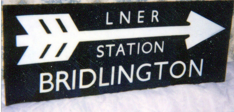 LNER Bridlington Station Direction Sign 22.4.1999
 by
A1 Northeastern, on Flickr
Re: LNER Platform & Station Signs
Posted: Sat May 28, 2022 11:47 pm
by john coffin
Not sure how many people know about the Doncaster Library railway museum which includes a lot of the stuff
that was in the Doncaster schools collection. There are many name plates and other things on display.
The balance of the collection is going to be available for viewing I believe later in the year.
If you are in the newly made city of Donnie, then seeking out, not too far from the station,
it also houses at this time an Atlantic and Green Arrow V2.
Paul
Re: LNER Platform & Station Signs
Posted: Sat Jun 11, 2022 9:41 pm
by Starbeck50D
Appreciate all the feedback! Precision Paints Oxford Blue is also similar, but when you paint a small spot on the edge of the enamel to compare it's not right. Looks like I will just have to experiment with some mixing of blues and purple, maybe a drop of black. If I get close I will post the "recipe".